Monday morning the Beige Depression hit me earlier than normal. In fact, it was pretty much as soon as I got into the office. In a desperate bid to get some goddamned color into my cubicle, I ended up covering one of my beige overhead cabinets in neon pink, yellow, and green post-it notes.
It’s a sort of checkerboard pattern, nice and painful to the eyes. I wrote “beige” on each one and then, marvelling at the accidental work of art I’d created, I printed up a small tag like from the museums describing the artiste, the artwork, and the medium used (Post-Its on cubicle cabinet, with ballpoint). I call it “An Explosion of Beige.”
As you can tell, I have developed an intense dislike for beige and its associated colors: willow, sand, french beige, and Soft Ecru by Glidden.
But more importantly than all of that is the resultant effect, which is that my attitude is trending towards the less-assholish. I know, I’m shocked too. It’s turned into a grand experiment on myself and it’s having distinct effects that I think should be described as positive.
It’s common knowledge that in office environments, colors can help set moods. Neutrals like grey and beige and assorted pastels are expected to impart a calm feeling. A study by NASA showed that that was true most of the time: a hefty chunk of the people studied were found to work better in a room painted a blindingly bright red rather than the pastel room. I think I may have found why I keep my home office painted Mountain Dew Green.
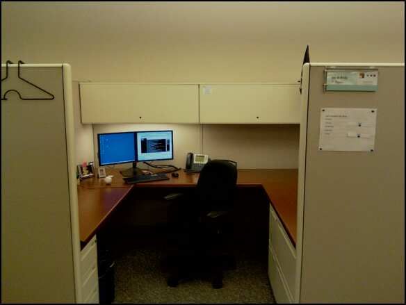
Update: to illustrate, here’s a picture of my cube before the art was installed. Note the beige walls, beige cube walls, beige cabinets, the beige light, and the grey carpet (flecked with beige).